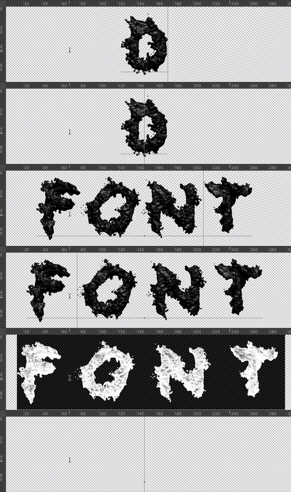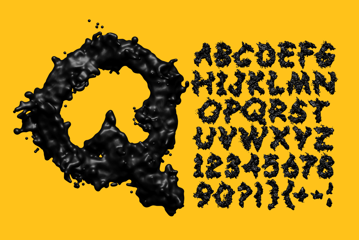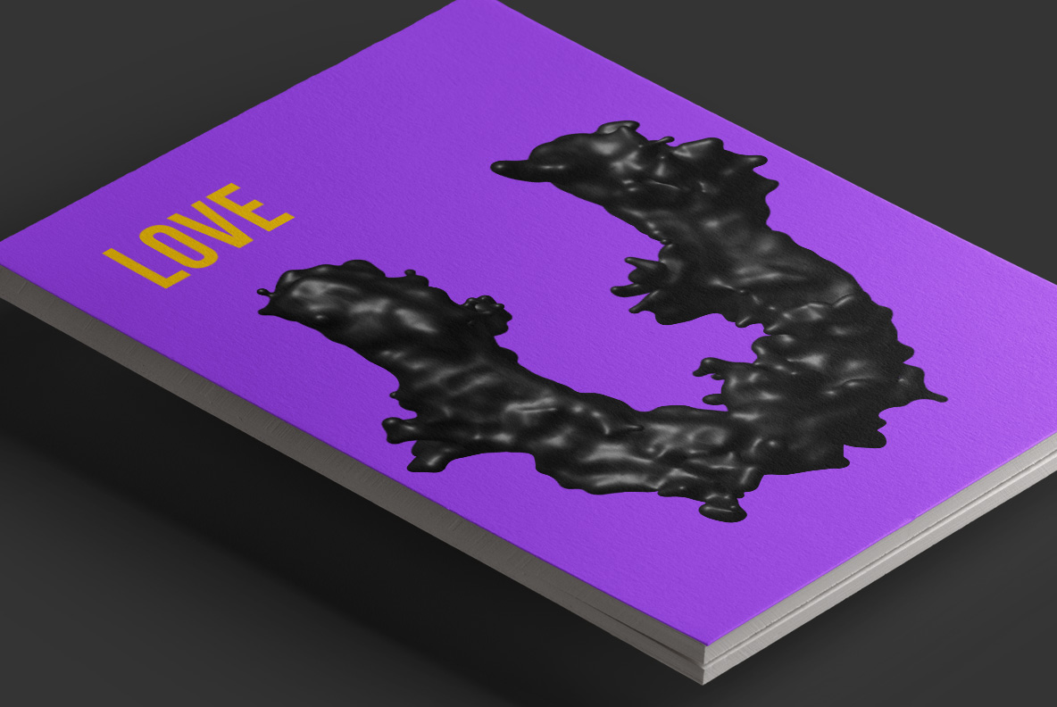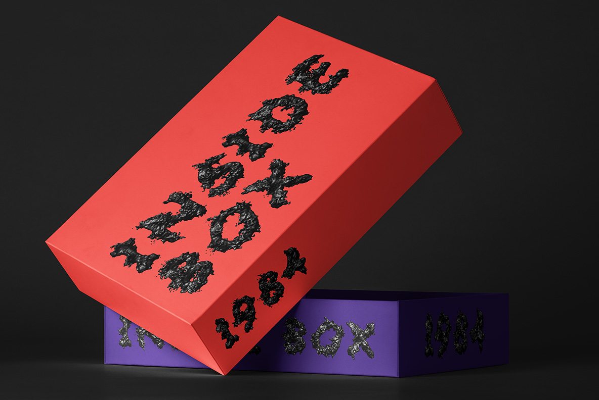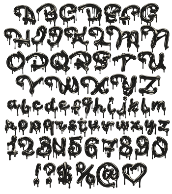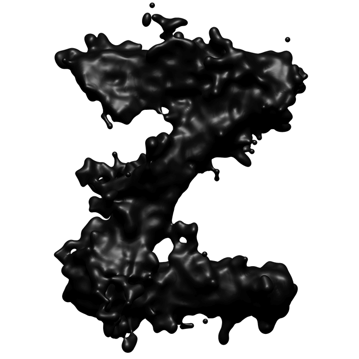
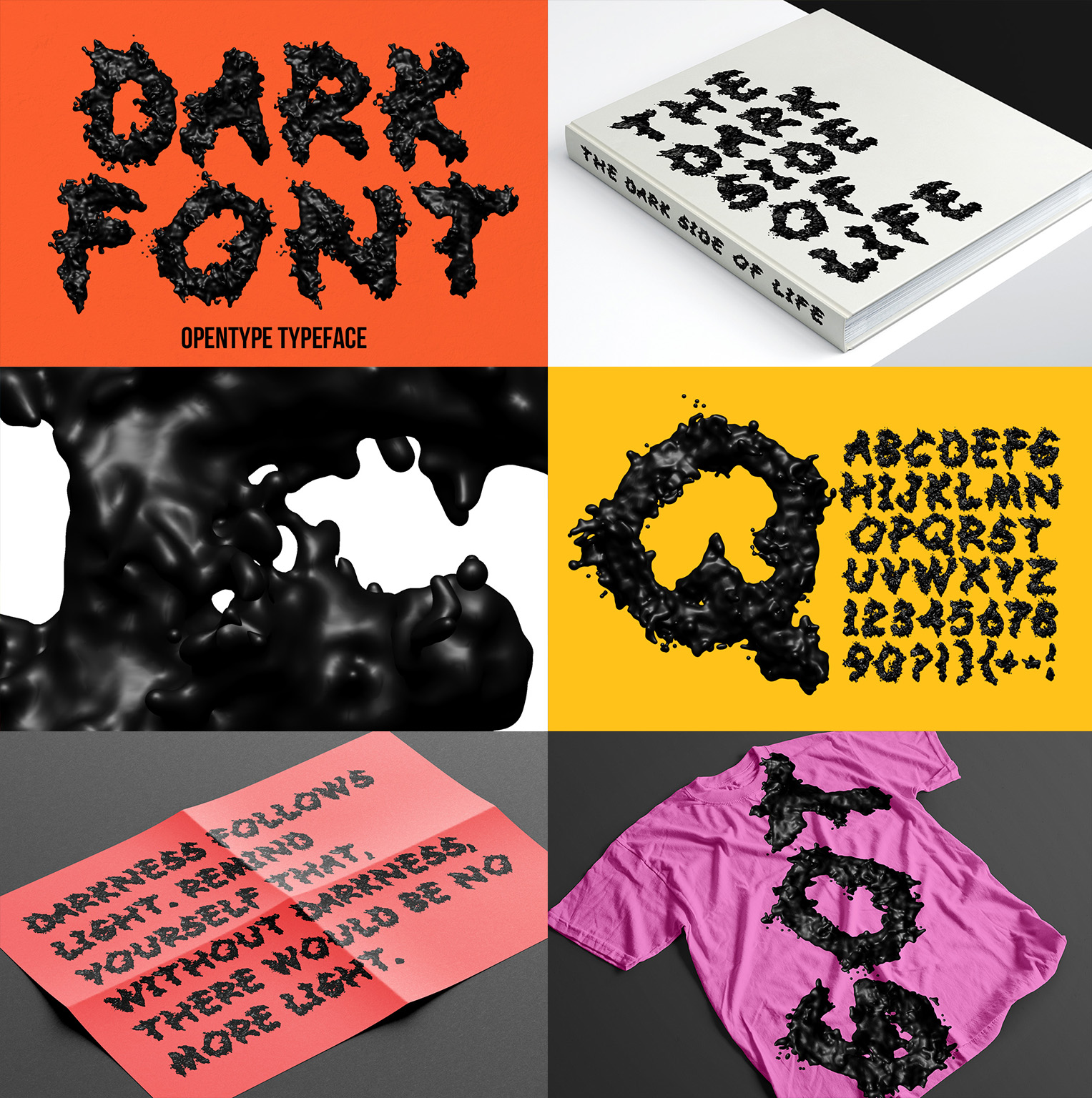
Something thick and black hit the page and stayed there. Each letter bulges outward in wet lobes, then throws small droplets clear of its own edges. The surface is properly glossy, so the studio lights show up as hard white streaks. Read it as tar, ink or oil; all three work, and none of them behave.
Liquid Caught Mid-Splash
Nothing here is drawn with a pen, obviously. Every stroke swells and pinches like a real fluid under surface tension, so the widths change constantly. Droplets have flung off the outer curves, while thin threads still connect a few of them. The Dark Font keeps a glossy skin throughout, therefore highlights race along every bulge. Counters close up in places, since liquid does not respect a counter. Shadows underneath stay soft, because the mass sits rather than floats.
Black That Still Shows Its Shape
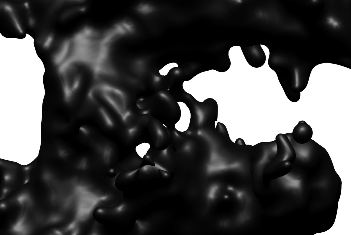
Pure black would collapse into a flat silhouette, so the Dark Font leans on highlight instead. Sharp white streaks map each lobe, if the background is bright enough. Where two lobes meet, the crease goes almost matte, naturally. The droplets each carry a tiny catchlight, then fade into grey at their edges. Contrast stays extreme throughout, because there is no mid-tone in the material. Set it on white and the whole thing looks wet.